(Screen width)
Website report
This is a short report on the progress of building EASA’s new website. It uses the photos submitted by members and selected by the EASA exec committees.
The colours and graphics in this report are modified versions of the design produced by Juhani Juurik, recreated as live web design and modified to meet the feedback from the EASA’s president of a lighter and more colourful mood.
Ethnography of science III
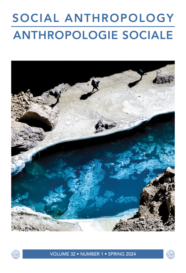
2022, Svalbard, Norway
Photos
The sizes, resolutions and dimensions of photos supplied to us by EASA members, represents a challenge in terms of design.
The photo in the background of this box, an example of how a portrait size photo can be used in combination with the box and curve, to form a full size page title background. In this way, we can achieve full size colour backgrounds with fieldwork photos which by their nature, vary in dimensions and quality.
Design
The boxes use custom designed curves, copied from the EASA brand guide to create movement and contrast, and their vaguely humanoid shapes give a nod to the field.
The boxes with their content, photos and buttons are designed for desktop and ready to be used on the website pages, pending adjustments for different screen sizes.
Image relevance
The design also incorporates image content from EASA’s output and services such as the Journal or Conferences.
This is a design feature which allows for smaller, low-resolution images to be used, so that when it comes to imagery, we can maintain relevance as the deciding principle, rather than choosing either no image, which will leave us with a very monotonous website, or high quality but irrelevant images.
Content migration
The old website is comprised by pages with html code. Elements such as events, people and publications are listed in paragraphs and headings, with images manually coded into the pages. This is a laborious process which results in inconsistent formatting. The manual quality of this work causes content to become outdated, and updates can be slow, causing frustration among network convenors and others.
Analysing and re-organising data
The new website treats content elements such as events, people and publications as separate posts with set fields for types of content. For example, all events are added separately and all have common fields for date, location and deadlines. People profiles are also separate posts, and have fields for EASA role, external links and other EASA involvement. This is not an automatic import job!
Advantages
- Each post has its own url which can be promoted separately on social media
- Templates query posts into relevant pages, such as events by networks or people by committee.
- Quickly add content and data without spending time on formatting and linking – focusing on promoting the content
- Safe to involve other editors such as network convenors as the risk of inconsistent formatting and broken internal links are removed
What remains?
So far, we have moved/split content into:
- 405 posts
- 324 events
- 140 people
- 274 publications
- 14 votes/elections
- 1045 images/downloads
Little content remains. What remains is mostly styling, adding editors such as network convenors, and training those.